Week 3 Notes
STAT 251 Section 03
Lecture 4: Monday, Jan. 22nd 2024
Describing the shape of a distribution.
The purpose of a graph is to help us understand the data. Once the distribution of variable is plotted, you must ask yourself “what do I see?”. This is when were look for the features of a distribtuion such as shape, center and spread. This helps us to identify interesting patterns or potential outliers - individual data points that lie outside the normal pattern of the distribution.
One of the first things we can look for are peaks of the distribution. A peak indicates values that are more likely to occur called the mode. A distribution can have no peaks, one peak, or multiple peaks. A distribution with one peak is said to be unimodal, a distribution with two peaks is bimodal and a distribution with multiple peaks is multimodal.
- bimodal or multimodal distributions typically indicate underlying population structure in the data. Take for example the following height data from Sir Francis Galton (1822–1911) who was an English statistician. Galton was interested in the relationship between the height of parents and their offspring. He accumulated the following observations of the height of 934 children from 205 families in 1886.
| family | father | mother | midparentHeight | children | childNum | gender | childHeight |
|---|---|---|---|---|---|---|---|
| 001 | 78.5 | 67 | 75.43 | 4 | 1 | male | 73.2 |
| 001 | 78.5 | 67 | 75.43 | 4 | 2 | female | 69.2 |
| 001 | 78.5 | 67 | 75.43 | 4 | 3 | female | 69 |
| 001 | 78.5 | 67 | 75.43 | 4 | 4 | female | 69 |
| 002 | 75.5 | 66.5 | 73.66 | 4 | 1 | male | 73.5 |
| 002 | 75.5 | 66.5 | 73.66 | 4 | 2 | male | 72.5 |
| 002 | 75.5 | 66.5 | 73.66 | 4 | 3 | female | 65.5 |
| 002 | 75.5 | 66.5 | 73.66 | 4 | 4 | female | 65.5 |
| 003 | 75 | 64 | 72.06 | 2 | 1 | male | 71 |
| 003 | 75 | 64 | 72.06 | 2 | 2 | female | 68 |
| NA | \(\vdots\) | \(\vdots\) | \(\vdots\) | \(\vdots\) | \(\vdots\) | NA | \(\vdots\) |
| 204 | 62.5 | 63 | 65.27 | 2 | 2 | female | 57 |
Now consider the histogram for child height:
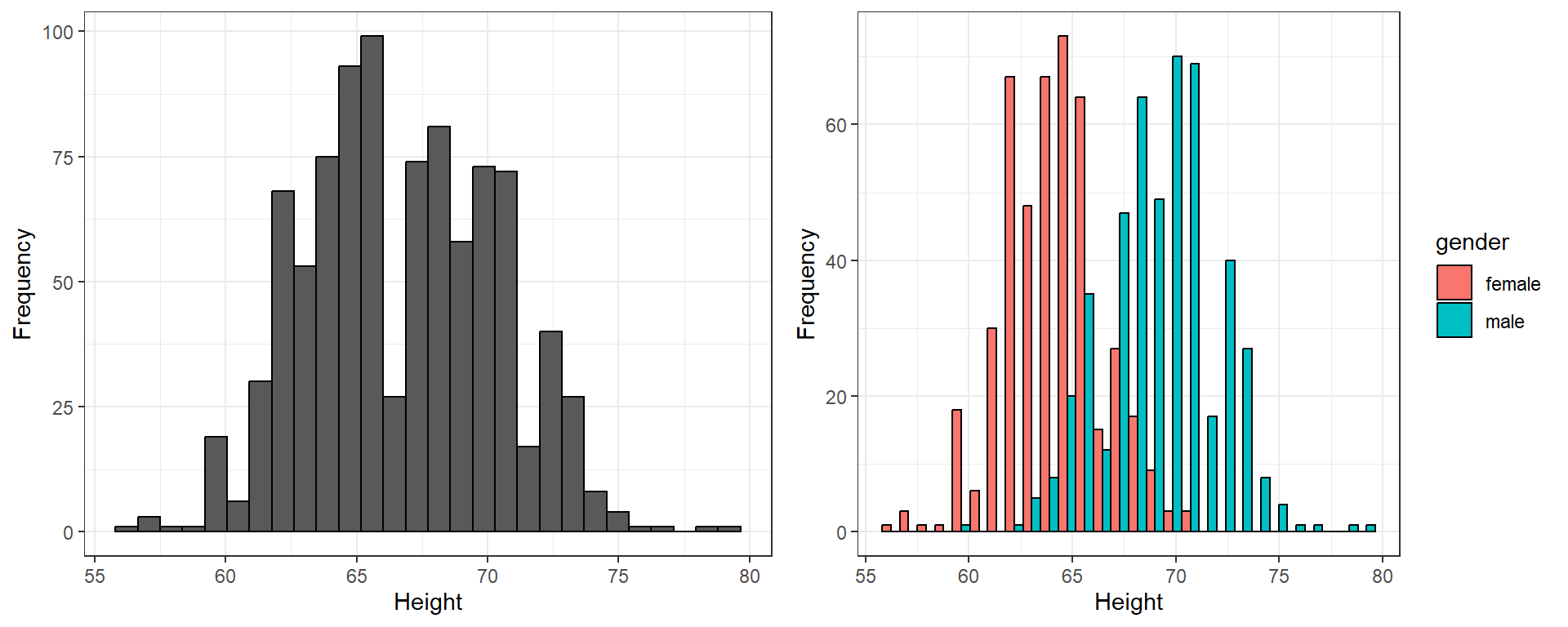
We can see from the histogram on the left that there are two clearly visible peaks. By coloring and segregating the bars according to gender we produce the histogram on the left which shows that the two peaks correspond to the gender of the children with males being about 10 inches taller on average.
Another question we may ask about the shape of a distribution is whether the distribution is symmetric or if it is skewed. A distribution is symmetric is the values that are smaller and larger than its midpoint are mirror images. A distribution is skewed right is the values larger than the midpoint form a long tail. Conversely, a distribution is skewed left if the values less than the midpoint form a long tail to the left
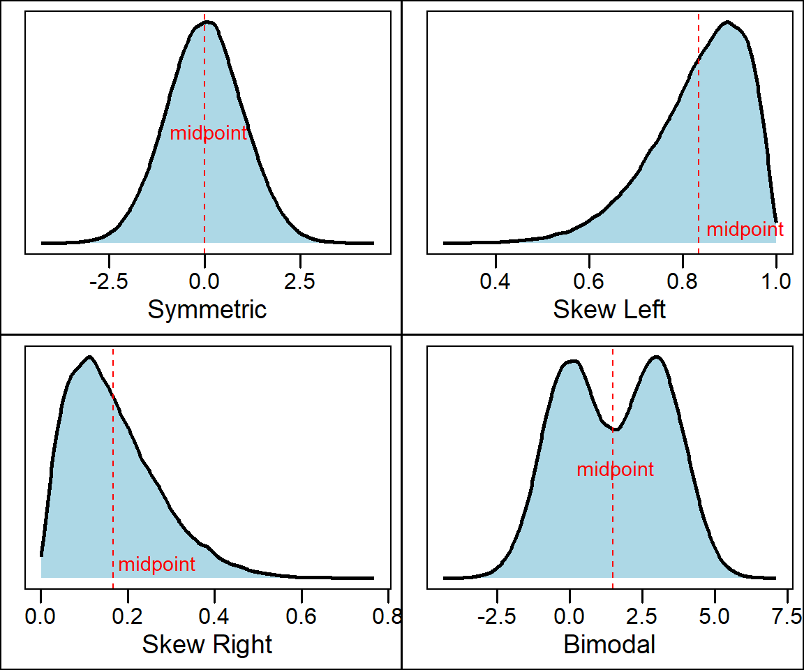
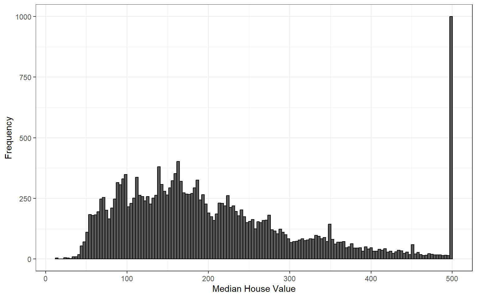
Many types of variables have distributions with predictable shapes. For example, variables that represent measurements of size from the same species and sex such as height, length, and age will have symmetric distributions. Variables related to money or finance on the other hand will often have skewed distributions. Skewness arises when there is a strict boundary on the values of a variable. For example, housing prices are always positive numbers and many houses will be a similar price while some houses many be really expensive. For example, consider the distribution of housing prices from the 1990 california housing census data downloaded from Kaggle
Lastly, one of the most important things a graphical summary of a variable can show is outliers. As previously noted, these are extreme values that fall far away from the normal pattern of the data. An outlier may be a result of measurement error or it can represent a real datapoint. Either way, outliers can strongly influence any analyses we conduct later on during statistical inference and are crucial to be aware of. Consider the following histogram of fuel efficiency (measured in miles per gallon) of several different car brands between 1999 and 2008 obtained from https://fueleconomy.gov/
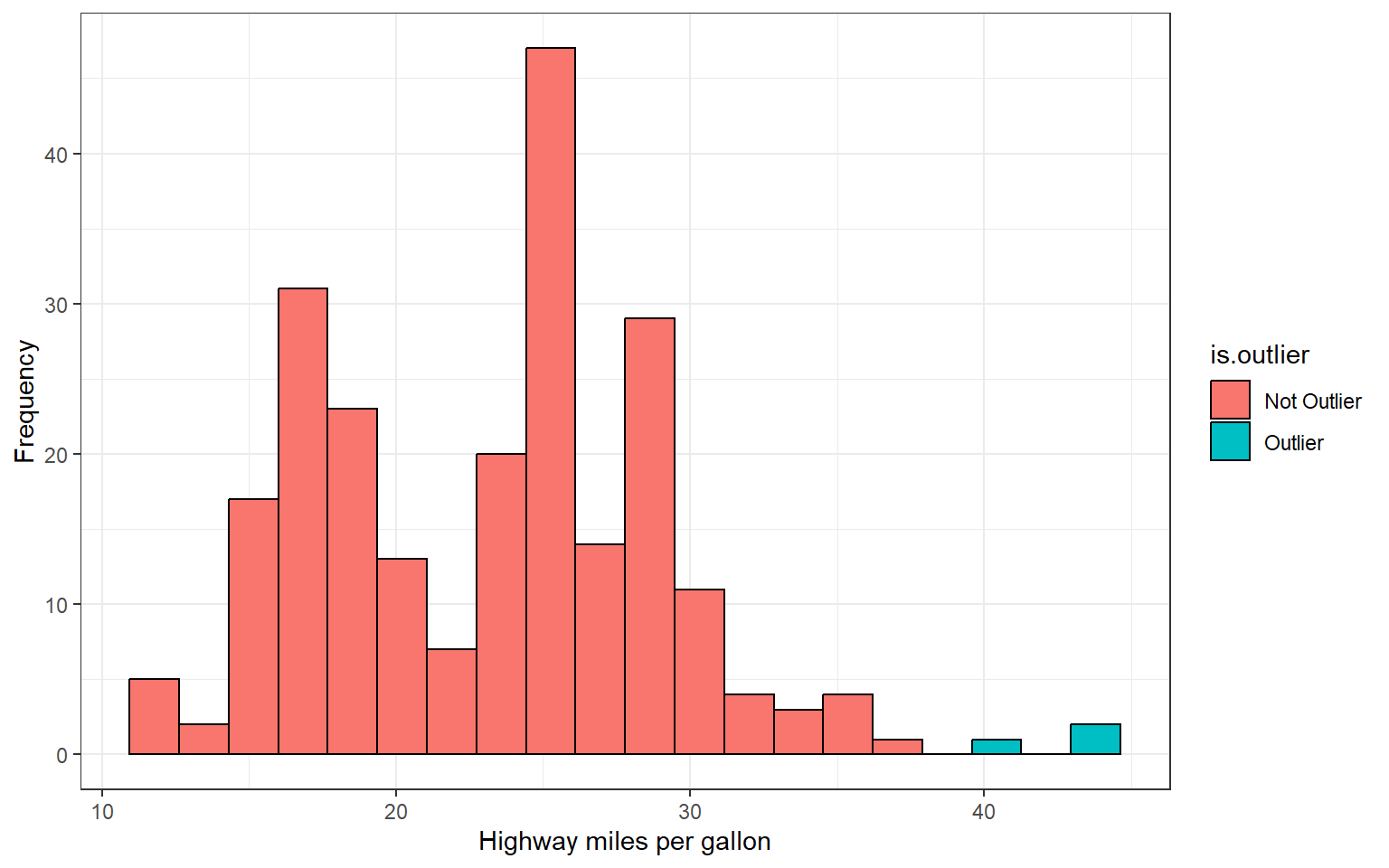
How would you describe the shape of this distribution?
From the histogram we can see there are two bars that fall far to the right of the rest of the distribution. The observations comprising these bars constitute potential outliers. In fact, these three observations belong to the 1990 volkswagen beetle and jetta which was extremely fuel efficient for its time
Describing distributions with numbers
Any description of the distribution of a variable is not complete without some numbers describing its center and spread. Previously, we learned how to describe shape by visually inspecting a graph of the data such as a histogram, stem plot, or dot plot. Now we will learn some statistics we can calculate that will tell us about spread and center. It’s important to note that we can calculate these descriptive statistics for any quantitative variables but NOT for qualitative variables. We will start by talking about statistics for quantifying the center of a distribution. Two measures of center are the mean and the median
Measures of center
The arithmetic mean (denoted \(\bar{x}\)) is the average value of a set of observations and tells us the center of mass or balancing point of a distribution \[\bar{x} = \sum_{i = 1}^n \frac{x_i}{n} = \frac{x_1 + x_2 + \cdots + x_n}{n}\]
- the symbol \(\Sigma\) means to “add up a set of values”. Therefore, the mean is the sum of all observations in the sample (or popultion) and divide the sum by the number of observations
- the mean is usually not equal to any of the values observed in the sample
- The mean is highly influenced by outliers. Outliers pull the value of the mean in their direction.
The other measure of center is the median or middle value. To calculate the median, we must first arrange the data in order from least to greatest. If the number of observations \(n\) is odd then the median is exactly the middle value. If the number of observations \(n\) is even, then the median is the “average” of the two values in the middle.
- The median is resistant to outliers because it does not depend on their value like the mean does.
Example: consider the following 8 observations of a quantiative variable \(X\): \[X = \{ 1, 3, 5, 5, 6, 7, 7, 8\}\] Compute the mean and median of \(X\)
\[\bar{x} = \frac{1+3+5+5+6+7+7+8}{8} = 5.25\]
\[\text{median} = \frac{5+6}{2} = 5.5\]
Now consider a the mean and median when we include the outlier observation \(X = 22\) and note it’s effect each statistic:
\[X = \{ 1, 3, 5, 5, 6, 7, 7, 8, 32\}\]
The mean becomes \[\bar{x} = \frac{1+3+5+5+6+7+7+8+32}{8} = 8.22\]
The median becomes \[\text{median} = 6\]
Notice that in the first set of calculations the mean was less than the median. Now, because of the presence of the outlier, the mean has surpassed the value of the median because the “weight” that the outlier carries in terms of its value.
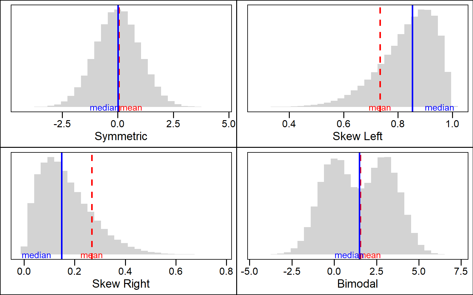
- This example illustrates how the mean and median behave depending the shape of a distribution. Distributions with skew will pull the value of the mean in the direction of the tail while the median will always be close to the mode of the distribution
 ### an alternative formula for the mean: We can also compute the mean
using the frequency or relative frequency using the following
formulas
Using the frequency \[\bar{x} = \sum_x \frac{x\times \text{freq}(x)}{n}\]
Using the relative frequency \[\bar{x} = \sum_x x \times rf(x) \]
- where \(\sum_x\) means to sum over all values of x and \(freq(x)\) and \(rf(x)\) denote the frequency and relative frequency of \(x\) respectively.
Example: Sir Ronald Fisher’s famous iris data set gives the measurements in centimeters of the variables sepal length and width and petal length and width, respectively, for 50 flowers from each of 3 species of iris. Consider the following frequency table of petal lengths rounded to the nearest whole centimeter
| Petal Length (cm) | Frequency | Relative Frequency | Cumulative Relative Frequency |
|---|---|---|---|
| 1 | 24 | 0.16 | 0.16 |
| 2 | 26 | 0.17 | 0.33 |
| 5 | 3 | 0.02 | 0.35 |
| 4 | 34 | 0.23 | 0.58 |
| 3 | 35 | 0.23 | 0.81 |
| 6 | 24 | 0.16 | 0.97 |
| 7 | 4 | 0.03 | 1.00 |
We can compute the mean petal length using either of our formulas from above:
- Using frequency
\[\bar{x} = \frac{1(24)+2(26)+5(3)+4(34)+3(35)+6(24)+7(4)}{150}\approx 3.76 \]
- Using the relative frequency
\[\bar{x} = 1(0.16)+2(0.17)+5(0.02)+4(0.23)+3(0.23)+6(0.16)+7(0.03)\approx 3.76\]
Measures of location
We have several numerical quantatities that we can compute from a distribution that tell us where certain values fall in the distribution. We call these measures of location because they tell us things are in the distribution. One of the simplest measures of location that have heard before is the mode.
- The mode is the most frequent value or category of
a variable. It corresponds to peaks on the distribution. The mode tells
us what the most likely values in the distribution are. The following
are some key things to consider about the mode
- The mode may not be unique. For example, a bimodal distribution will have two different values for the mode
- The mode is NOT a measure of center. For symmetric distributions with a single peak it will be approximately the same as the median and mean but for distributions that are skewed or have multiple peaks the mode may not be anywhere near the center of the distribution.
Lecture 5: Wednesday, Jan. 24th 2024
More measures of location
Other useful measures of position are percentiles. The \(p^{th}\) percentile of a distribution is the value that has \(p\) percent of the observations fall at or below it. Take the following simple example of 13 observations of the outcome of rolling a fair six-sided die \[X = \{1,2,2,2,2,2,3,4,4,5,5,6,6\}\]
What is the \(50^{th}\) percentile of \(X\)? Given the definition above the \(50^{th}\) percentile of \(X\) is \(3\) because half of the observations in the sample are at or below 3. Consequently, the \(50th\) percentile is also the median. By definition the median divides the data in equal halves with \(50\%\) of observations at or below or the median and the remaining \(50\%\) of observation having a value greater than or equal to the median.
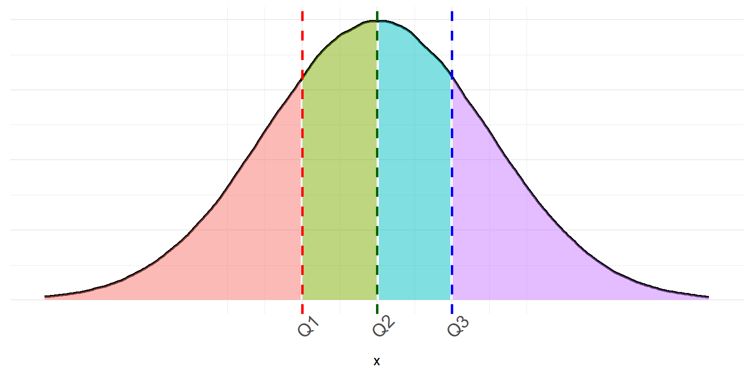
Two other commonly useful percentiles are the \(25^{th}\), and \(75^{th}\) percentiles. Together with the median we call these percentiles the quartiles because they divide a distribution into quarters. * We denote the first quartile (\(25^{th}\) percentile) as \(Q1\). It is the median of the lower half of the data. * We denote the \(50^{th}\) percentile or median as \(Q2\) * We denote the third quartile (\(75^{th}\) percentile) as \(Q3\). It is the median of the upper half of the data
Example: Consider the following 15 exam scores of students in a statistics class:
\[\{61,61,65,65,66,68,69,73,74,75,76,78,79,90,94\}\]
Find the Q1, Q2, and Q3 quartiles for these exam scores. * It’s easiest to start with Q2 and work from there. Q2 is the median of the data and, since \(n\) is odd will just be the middle value. In this example \(Q2 = 73\). Now that we have the middle value we can divide the data into its upper and lower half. The lower half of the data contains the values
\[\{61,61,65,65,66,68,69\}\]
To find the first quartile we simply find the median of this subset of the observations which is \(Q1 = 65\). Lastly we repeat this process for the upper half of the data to find the value of the third quantile. The upper half of the exam scores is the subset
\[\{ 74,75,76,78,79,90,94\}\]
and the median is \(78\), therefore \(Q3 = 78\).
Measures of spread
Even the simplest statistical description of a variable should include at least one measure of center and one measure of spread. The reason being that measures of center or location can be misleading if we do not consider how much the observations vary. Consider the following example which gives the distributions of the number of youtube video views of two content creators.
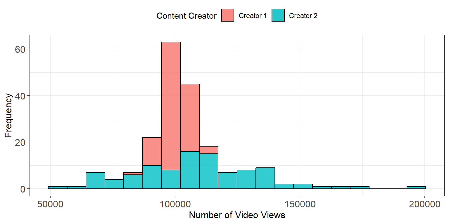
From this example we can see that both distributions have approximately the same mean. However, Content Creator 2 has considerably more variability in the number of views and, on a good day, can potentially get up to double his normal number of views.
In some sense giving several percentiles or the quartiles together tells us how different values are spread out across the distribution but there are other measures of spread that are preferred. One of the first and simplest measures we can use is the range. The range measures the distance between the largest and smallest observation and can be computed by subtracting the minimum value from the maximum value. Because the range uses the two most extreme points of the data it is extremely susceptible to outliers. For this reason, the range is not a measure of spread that gets used often.
A better measure of spread that can be computed from the first and third quartiles is the interquartile range or IQR. The IQR tells us how dispersed the inner \(50\%\) of the data.
The IQR is defined as
\[IQR = Q3 - Q1\]
It measures the distance between \(Q1\) and \(Q3\)
The IQR is very resistant to outliers since it ignores the extreme ends of a distribution
What is the IQR for the previous example of statistics students exam scores?
A five number summary
Combining several numerical descriptors together is the best way to get a good feel for the characteristics of a distribution. A common method for summarizing a set of data is to use the five number summary which combines the minimum, maximum, and quartiles together.
- The five number summary: \(\text{Miniumum} \ \ Q1 \ \ \text{Median} \ \ Q3 \ \ \text{Maximum}\)
Consider the five number summary of the statistics student exam scores:
\[61 \ \ 65 \ \ 73 \ \ 78 \ \ 94\]
The median tells us the center of the data, the quartiles show us the spread of the inner half of the data, the minimum and maximum tell us the total extent of spread in exam scores.
Often these five numbers are displayed graphically in a plot called a box and whisker plot (often called a boxplot). Together with the histogram, the boxplot is one of the most useful graphical summaries because it condenses a lot of information into an easy to create display.
- Steps for constructing a boxplot:
- Mark the position of the first and second quartile and draw a box connecting them.
- Draw a line inside of the box showing the position of the median
- From each end of the box, draw a line extending outward \(1.5 \times IQR\).
- The lower whisker is drawn to either the minimum value or \(Q1 - 1.5 \times IQR\) depending on which is greater.
- The upper whisker extends to either the maximum value or \(Q3 + 1.5 \times IQR\) depending on which is smaller
- Any observations extending beyond \(1.5 \times IQR\) below Q1 or above Q3 are marked and considered outliers.
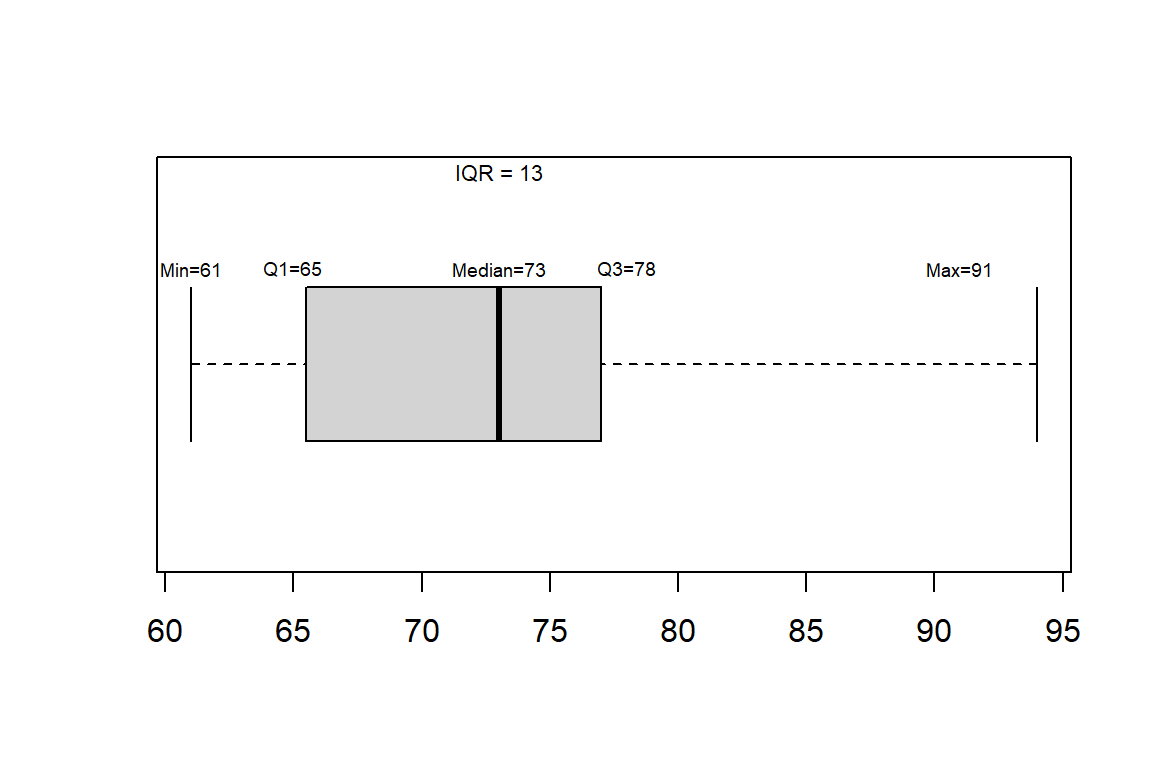
Example: consider the boxplot constructed for our example of student exam scores
\[\{61,61,65,65,66,68,69,73,74,75,76,78,79,90,94\}\]
Example2: consider the boxplot constructed for variable \(X\)
\[X = \{-5.7, -2.6, -1.5, -1.3, -0.4, 0.2, 1.5, 2.2, 2.3, 2.6, 2.9, 10.4 \}\]
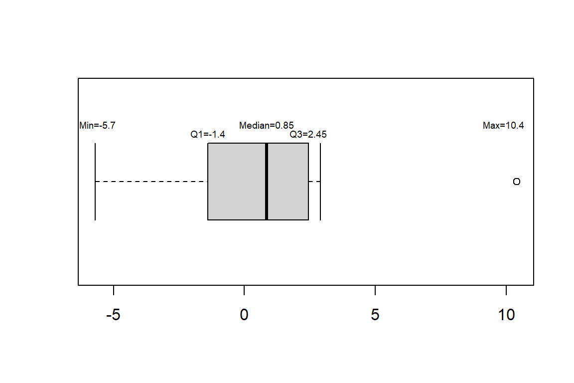
- boxplots are great for comparing distributions and identifying skew. Consider our example for comparing the youtube views of two content creators.
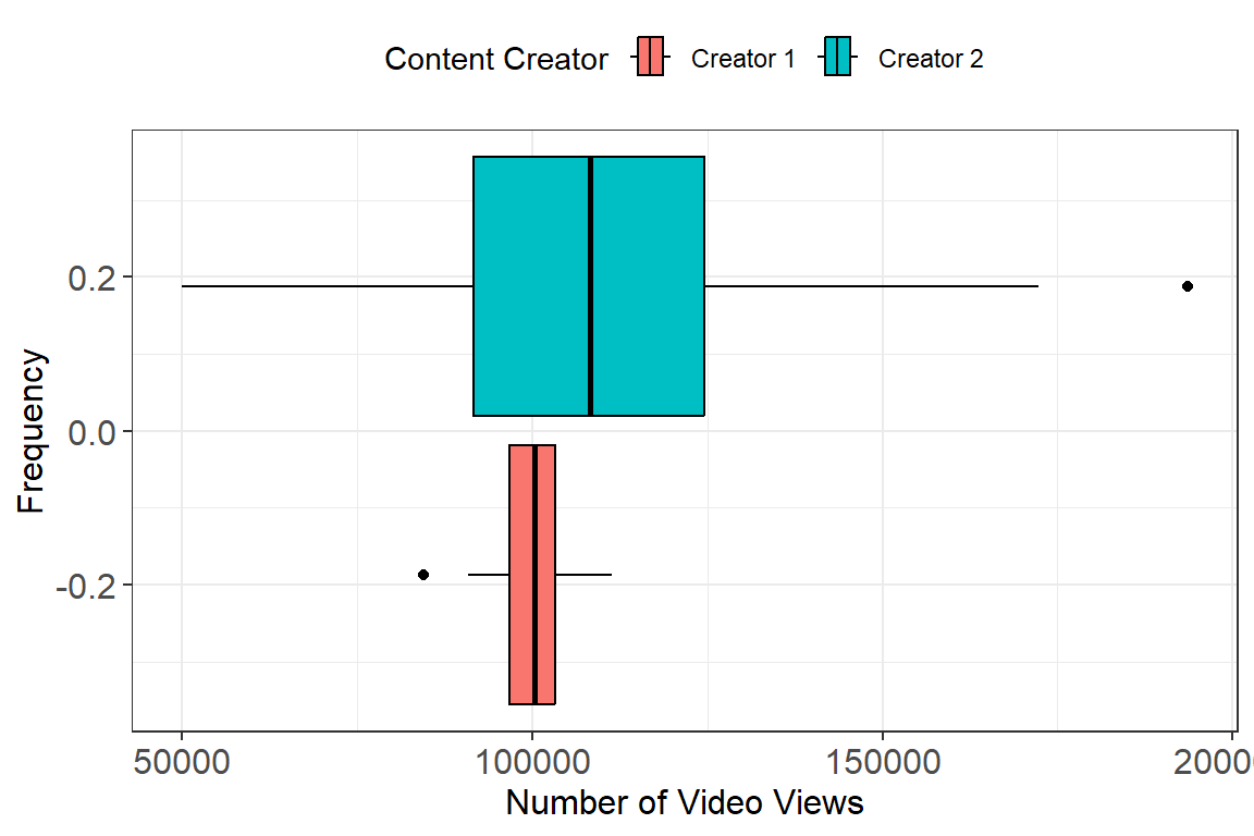
- Using the boxplots makes the disparity in spread between the two Content Creators much more apparent. Boxplots are also great for identifying skew in a distribution. Consider the plot below which shows how you can interpret skew in relation to a boxplot.
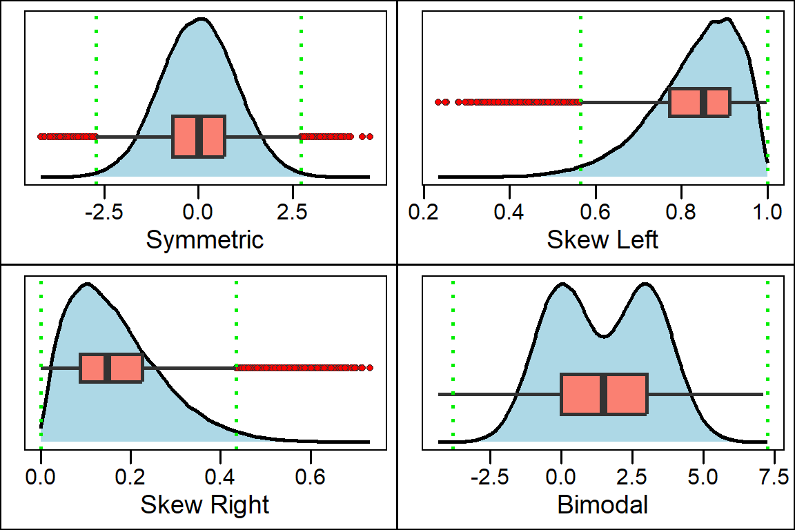
- Notice from the plot above that the boxplot will not show if the distribution has multiple peaks or gaps. For this reason, a boxplot should always be plotted along with a histogram to ensure you capture all important features of a distribution.